Weekly Puzzle #6: Market Risk Exposure
The Set up
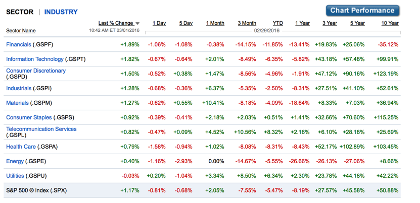
While risk and return models try to measure risk using regressions of stock returns against market indices, it is only during crisis periods that you really see the differential risk across sectors or businesses. One simple way to back out a measure of market risk exposure (an implied beta) is to take a periodwhere markets were in crisis (say January-February 2016) and look at differences in returns across sectors. It is dangerous to base everything on a month but it is an interesting technique.
This year's Carnage
If you are interested in a longer time period visualization of the sectors, try this link. It is a neat one, since it lets you highlight a sector and see how it shifts over time.
Questions/
discussion issues
- Based upon just the YTD returns, what was the riskiest sector in the market and which one was the safest?
- Why might you want to be cautious about generalizing this finding?
- If you had this data for the worst 50 months in the market, would you be able to use it to get a measure of the relative risk of each sector and convert it into a number that looks like a beta?