Technical Indicators and Charting Patterns
Over the years, technical analysts
have developed hundreds of technical indicators and detected dozens of chart
patterns that they contend help them forecast future price changes. While we
cannot describe or even list all of them, we can categorize them based upon the
nature of irrationality that we attribute to markets. Consolidating all of the
irrationalities that have been attributed to financial markets, we have created
five groupings:
- Market
participants over react to new information: If this is true – prices rise
too much on good news and fall too much on bad news – you would draw on
contrarian indicators which would help you to gauge the direction in which
the crowd is going and to go against it.
- Market
participants are slow learners: In many ways, this is the polar opposite
of the first grouping. If investors are slow learners, prices will under
react to new information and you would expect price direction to persist
and use momentum strategies, which would gauge market direction and move
with it.
- Investors
change their minds frequently and often irrationally, causing significant
shifts in demand and supply, causing prices to move. If you believe that
this is the way markets work, you would use technical indicators and
charting patterns to detect these shifts.
- There
are a group of investors who lead markets, and finding out when and what
they are buying and selling can provide a useful leading indicator of
future price movements. If
this is what you believe about markets, you would track the trading of
these leading investors and try to follow them.
- There
are external forces that govern up and down movements in markets that
override fundamentals and investor preferences. Technical indicators and
charting patterns that allow up to see their larger cycles in stock prices
can allow us to get ahead of other investors.
Within each, we can consider different technical indicators
that we can broadly categorize into three groups – price indicators, which are
based upon past price movements, volume indicators, that look at trading volume
and sentiment indicators, that use qualitative measures of how bullish or
bearish investors feel about stocks.
Markets overreaction - Contrarian Indicators
There are many practitioners and some economists,
especially in the behavioral school, who believe that investors overreact to new
information. This, in turn, can create patterns in stock prices that can be
exploited by investors to earn excess returns. In this section, we consider
some of the indicators, which we label contrarian, that have been developed by
analysts who subscribe to this view.
The Basis for Overreaction and Implications
Why would markets over react to new information? Some
researchers in experimental psychology suggest that people tend to overweight
recent information and underweight prior data in revising their beliefs when
confronted with new information. Others argue that a few investors tend to
panic when confronted with new information, and that they take the rest of the
market with them. As evidence, you could point to the strong evidence of price
reversals over long periods that we presented earlier in this chapter.
If markets overreact, it follows that large price
movements in one direction will be followed by large price movements in the
opposite direction. In addition, the more extreme the initial price movement,
the greater will be the subsequent adjustment. If markets overreact, the road
to investment success seems clear. You buy assets when others are most bearish
about it and selling, and sell assets when other investors are most optimistic
and buying. If your assumption about market overreaction is correct, you will
earn excess returns as markets correct themselves over time.
Technical Trading Rules based upon Contrarian Opinion
There
are a number of indicators, some based upon price patterns, some based upon
trading volume and some on market views that are designed to provide you with a
sense of market direction. The objective is to not follow the market direction
but to go against it and these are contrarian indicators. We will consider
three widely used indicators in this section, each of which focused on a
different subset of investors.
Trades that are in lots of less than a 100 are called
odd-lots and are usually made by small investors. There are data services that
track the number of odd-lot trades – both buys and sells - in individual
stocks and in the market. As small investors become more enthusiastic about a
stock, odd lot buys increase relative to sells. When they become pessimistic,
the reverse occurs. To the extent that you view small investors as more likely
to over react to information, you would sell as odd lot buying increases and
buy as odd lot selling decrease.
But what if you believe that it is institutional
investors who panic and not small investors? After all, large price movements
are usually caused by institutional buying and selling, rather than by
individual traders. There are indicators that track the stocks that
institutions are selling and buying, with the objective of doing the opposite. There
are also indicators that track the percent of mutual fund portfolios that is
invested in cash and near cash investments, a good indicator of how bullish or
bearish mutual fund investors are. When mutual funds are optimistic about the market,
cash holdings tend to fall, whereas cash holdings increase as they become more
pessimistic. If you believe that mutual fund managers over react, you would buy
when they are bearish and sell when they are bullish.
Finally,
you could look at investment advisors who claim to have divined the future. Investment
advisory services often have their lists of most desirable and least
desirable stocks. Value Line and Standard and Poor’s categorize stocks into
classes based upon their perceived attractiveness as investments. In keeping with
the notion that the market is usually wrong, you would sell those stocks that
investments advisors are most bullish on and buy those stocks where they are
most bearish.
Shifting Demand
Technical
analysts often argue that the greatest profits are to be made at what can be
called inflection points – a fancy term for shifts in price trends from
positive to negative or vice versa. Since price is ultimately determined by
demand and supply, analysts often look for leading indicators of shifts in
demand, especially when they are caused my emotion rather than fundamentals. If
they succeed, they will make money.
The Basis for Shifting Demand and Implications
The
basis for the shifting demand argument is that demand shifts cause price
changes and that these demand shifts often have no basis in economic
fundamentals. The anecdotal evidence seems to bear out this view. Markets often
move for no discernible reason and the volatility in stock prices seems to
vastly exceed the volatility in underlying value. The empirical evidence also
backs up the view that prices are more volatile than fundamental value. Shiller
compared stock price movements over time to movements in the present value of
dividends (which he viewed as a measure of fundamental value) and concluded that
stock prices were significantly more volatile (See figure 7.14)
Figure 7.14: Are markets too volatile?
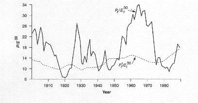
Note that the smoothed out line is the present value of
dividends, whereas the volatile line represents the S&P 500.
It should be noted, though, that
neither the anecdotal evidence nor Shiller’s study conclusively proves
emotional volatility, In fact, some researchers have argued that if the value
of a stock is based upon expectations, small news announcements can cause big
shifts in expectations and stock prices.
Technical Trading Rules aimed at detecting Shifting Demand
There
are numerous pricing patterns and indicators that chartists claim provide
advance warning of shifting demand. We will consider four broad measures here.
The first relate to the entire market, and measure the breadth of the market by
looking at the number of stocks that advance relative to those that decline.
The argument here is that a market
that goes up with limited breadth (a few stocks are creating much of the upward
momentum, while the rest are flat or declining) is a market where demand (and
prices) are likely to decline soon. In fact, an extension of this measure is
the advance/decline line, which is reported in many financial
newspapers, where you graph the ratio of the number of stocks that have gone up
to the number of stocks that have dropped. Here again, analysts argue that a
divergence between index levels and the advance/decline line – a drop in the
index accompanied by an improvement in the advance/decline line may indicate an
upcoming shift towards buying.
The
second is the presence (at least perceived presence) of support and
resistance lines in prices. A resistance line is an upper bound on the
price whereas a support line represents a lower bound on the price. Both are
extracted by looking at past prices. Thus, a stock that has tended to move
between $ 20 and $ 40 over the last few periods has a support line at $ 20 and
a resistance line at $ 40. It may be pure coincidence though we think not but
support and resistance lines often are nice round numbers – you very seldom see
a resistance line at $ 39.88 and a support line at $ 21.13. Figure 7.15
provides a chart with support and resistance lines.
Figure 7.15: Support
and Resistance Lines
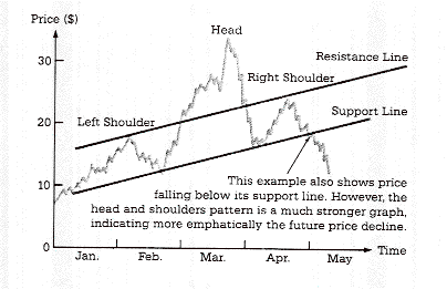
The fact that the stock stays below the resistance line and
above the support line is not news, but a stock that breaks through either gets
attention. When a stock breaks through the resistance line, technical analysts
view it as a sign of a shift in demand upwards and the beginning of a sustained
upward movement in prices. Conversely, when a stock falls below the support
line, analysts view it as a breakdown in demand and the precursor of a further
decline in prices. While the notion of arbitrary support and resistance lines
strikes us as fanciful, if enough investors buy into their existence, there can
be a self-fulfilling prophecy. To see why, assume that a stock with a
resistance line of $ 40 sees its stock price go up to $40.50. Investors who
believe that this is a beginning of a surge in prices will all try to buy the
stock on the event, causing the stock price to go up. Whether such a price
increase can be sustained for more than a few days is an open question. In the
graph, you can also see another widely followed chart pattern, called “head and
shoulders”. In fact, there are hundreds of patterns that chartists have
uncovered over time that have been offered as leading indicators of price
changes.[1]
Central
to much of technical analysis is a reverence for moving averages, i.e.,
averages of stock prices over the last few months or weeks. Often, you will see
price charts with a moving average line superimposed on actual prices. Again,
analysts view any deviation of stock prices from a moving average line as an
indication of an underlying shift in demand that can be exploited for profits.
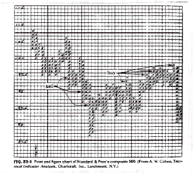
Analysts have also long used a
charting technique called point and figure to detect trends in prices.
The essential feature of a point and figure chart is that it is composed of a
series of Xs and Os. Each X represents a price movement of a given size called
a box size. As long as prices continue to rise, Xs are added to the column. If
there is a price decline of more than a given magnitude (called the reversal
size), a new column of Os is opened.
Figure 7.16 presents a point and figure chart.
Figure 7.16: Point and Figure Chart
In
recent years, information on trading volume for individual stocks has
become increasingly accessible. Technical analysts now routinely look at
trading volume for clues of future price movements, either in conjunction with
price changes or by itself. For instance, an increase in the stock price that
is accompanied by heavy trading volume is considered a more positive
prognosticator of future price increases than one generated with light volume.
Empirical Evidence on Technical Indicators
There
is not much empirical evidence for or against many of the individual charting
patterns. Part of the reason for this is that many of these patterns are so
subjectively defined – different analysts use different and often shifting
definitions of what comprises a support or a resistance line, for instance - that
they cannot be tested empirically, which serves both sides of the argument very
well. Supporters of charting can then use their own tests which are often
biased to offer proof that their patterns works. Opponents of technical
analysis can rest secure in their absolute conviction that charting is for the
naïve and the misguided and not worry about evidence to the contrary.
It
is quite ironic that some of the best defenses of technical analysis have been
offered by academics who would not categorize themselves as chartists or
technical analysts. Lo, Wang and Mamaysky (1998) present a fairly convincing
defense of technical analysis from the perspective of financial
economists. They use daily returns
of stocks on the New York Stock Exchange and NASDAQ from 1962 and 1996 and use
the most sophisticated computational techniques (rather than human
visualization) to look for pricing patterns. They find that the most common
patterns in stocks are double tops and bottoms, followed by the widely used
head and shoulders pattern. In other words, they find evidence that some of the
most common patterns used by technical analysts exist in prices. Lest this be
cause for too much celebration among chartists, they also point out that these
patterns offer only marginal incremental returns (an academic code word for
really small) and offer the caveat that these returns may not survive transactions
cots.
Are currency markets
different?
While
there is little empirical evidence to back the use of charts in the stock
market, a number of studies claim to find that technical indicators may work in
currency markets. To name a few:
·
Filter rules, where you buy a currency if it goes up by
x% and sell if it goes down by the same amount earned substantial profits in
the Deutsche mark, yen and sterling markets between 1973 and 1981.[2]
·
Moving average rules would have generated excess
returns in foreign currency markets.[3]
·
Head and Shoulder patterns would have generated excess
returns in the pound sterling, Canadian dollar, French franc and Swiss franc
markets between 1973 and1994. [4]
Though there are
dissenting voices, there clearly seem to be more opportunities for technical
analysis in currency markets. Some attribute it to central bank intervention.
When banks target exchange rates, they can generate speculative profits for
investors. Another possibility is that the foreign currency market is less efficient
that the stock market.
Slow Learning Markets: Momentum Indicators
If
investors are slow to assess the effects of new information on stock prices,
you can see sustained up or down movements in stock prices after news comes out
about the stock – up movements after good news and down movements after bad
news. There are analysts who contend that this is indeed the case and create
trading rules that take advantage of this slow learning process. Since these
rules are based upon the assumption that trends in prices tend to continue for
long periods, they can be categorized as momentum rules.
The Basis for Slow Learning and Implications
What
is the evidence that markets learn slowly? The best support for slow learning
markets comes from studies that look at information events such as earnings
announcements or acquisitions. As we will see later in this book, there is
evidence that markets continue to adjust to the information well after it has
come out. For instance, a firm that reports much better than expected earnings
will generally see its stock price jump on the announcement and continue to
drift upwards for the next few days. The same seems to occur to a target firm
in an acquisition. While there are alternative explanations for price drifts,
one potential explanation is that markets learn slowly and that it takes them a
while to assimilate the information.
If
markets learn slowly, you should expect to see prices move in the same
direction after a precipitating action. If the initial news was good – a good
earnings report or an earnings upgrade from an analyst – you should expect to
see upward price momentum. If the news was bad, you should expect to see the
opposite. In fact, recent empirical studies (referenced in the earlier part of
this chapter) have found evidence of price momentum in equity markets in the United
States at least in the short term.
Technical Indicators to take advantage of slow learning markets
Momentum
investors firmly believe that the trend is your friend and that it is critical that
you look past the day-to-day movements in stock prices at the underlying
long-term trends. The simplest measure of trend is a trend line. Figure
7.17 contains two trend lines – the graph on the left is for a silver futures
contracts over the few months of its existence and the graph on the right is
for cocoa futures over a much longer time period.
Figure 7.17: Trend Lines
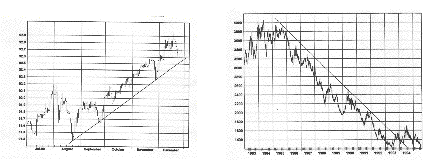
In this silver futures contract to the left, you see an
uptrend line, drawn by connecting a series of lows in prices, each one higher
than the other. On the right, cocoa prices had been declining over the period
in question and a down trend line is drawn by connecting a series of lower
highs. As momentum investors, you would buy stocks that are going up and
staying above the uptrend line. If the price falls below the uptrend line, it
is viewed as a negative sign. Conversely, if the price rises above a down trend
line, it is considered a bullish sign.
A
closely followed momentum measure is called relative strength, which is
the ratio of the current price to an average over a longer period (say six
months or a year). Stocks that score high on relative strength are therefore
stocks that have gone up the most over the period, whereas those that score low
are stocks that have gone down. The relative strength can be used either in
absolute terms, where only stocks that have gone up over the period would be
considered good investments. Alternatively, the relative strength can be
compared across stocks, and you invest in stocks that show the highest relative
strength – i.e, have gone up the most, relative to other stocks.
Following the Informed Investors: Leading Indicators
This approach is the flip side of
the contrarian approach. Instead of assuming that investors, on average, are
likely to be wrong, you assume that they are right To make this assumption more
palatable, you do not look at all investors but only at the investors who
presumably know more than the rest of the market.
The Basis for Following Smart Investors and Implications
Are
some investors smarter and better informed than others? Undoubtedly. Do they
make higher returns as a consequence? Not necessarily. As Keynes was fond of
pointing out, a stock market is a beauty contest, where the prize goes to the person
who best gauges who the other judges in the contest will pick as the winner. In
investment terminology, the high returns often go to the investor who can best
pick the stocks that other investors will buy.
There are two keys to making a
strategy of following other investors work. The first is identifying the smart
investors, who may not always be the largest or best known. It stands to reason
that investors who have access to the best information are most likely to beat
the market and would be the ones that you should follow. The second is to find
out when and what these smart investors are trading in a timely fashion, so
that you can imitate them. This is often difficult to do. Even though insiders
and institutions have to file with the Securities and Exchange Commission
(SEC), providing details about their trades, the filings are made several weeks
after the trades occur.
Technical Indicators for Followers
There
are several technical indicators that attempt to pinpoint what better informed
investors are buying and selling. Here, we consider two. The first looks at short
sales made by market specialists. Since these specialists are close to the
action and have access to information that the rest of us cannot see (such as
the order book and trading on the floor), it can be argued that they should
have an inside track on over priced and under priced stocks. Thus, a surge in
specialist short sales in a stock would be a precursor for bad news on the
stock and a big price drop. Some analysts look at all short sales made on a
stock, arguing that only larger, more sophisticated investors can short stock
in the first place. A study by Senchack and Starks in 1993 provides some
support for this indicator by noting that stock returns tend to me more
negative for stocks where the short interest (short sales as a percent of the
outstanding stock) is higher.
In
the last few years, as the SEC has speeded up the process of recording
transactions by insiders and has made this data more easily accessible to the
public. You can therefore look up stocks where insider buying or selling
has increased the most. In fact, the ratio of insider buying to selling is
often tracked for stocks with the idea that insiders who are buying must have
positive information about a stock whereas insiders who are selling are likely
to have negative information.
Long Term Cycles: Mystical Indicators
The
final set of technical indicators are based upon long term cycles in prices
that exercise an inexorable hold on how prices move. Since these long-term
cycles operate independently of fundamentals, it is very difficult to explain
them without resorting to mysticism.
Basis for long term cycles and Implications
There
are two ways in which you can defend the use of long-term cycles. One is to
abandon any basis in rationality and argue that there are a number of phenomena
in nature that cannot be explained with models.[5]
You can think of such investors as subscribers to the karmic theory of
investing. In other words, everything that happens has already been
pre-destined and there is nothing that we can do to stop it. This requires an
almost religious belief that cycles will replicate themselves. The other
defense is based on market behavior. You can argue that investors, even though
they might be separated over time, behaved in very much the same way in the South
Sea Bubble as they did in the dot-come bubble. Consequently, long term cycles
reflect the pricing mistakes that investors make and remake over time. As a
cautionary note, you should realize that if you look for patterns too intently
in charts, you will find them, especially if you use visual techniques (rather
than statistical ones).
Technical Indicators based upon Cycles
While
there are numerous cycles that analysts see in stock prices, we will consider
two in this section. In the first, the Dow Theory, the market is
considered as having three movements, all going at the same time. The first is
the narrow movement (daily fluctuations) from day to day. The second is the
short swing (secondary movements) running from two weeks to a few months and
the third is the main movement (primary trends) covering at several years in
its duration. Proponents of the theory claim that you can tell where you are in
the primary cycle by charting the industrial and transportation components of
the Dow Index and looking for confirmation (i.e, both indices moving in the
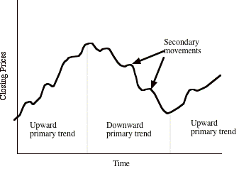
same direction). In figure 7.18, the Dow Theory is presented:
Figure 7.18: The Dow Theory
In 1922, William Hamilton wrote a book titled “The
Stock Market Barometer”about the Dow Theory, where he presented evidence on its
efficacy at predicting market movements.
A recent study[6]
appraised Hamilton’s predictions in the Wall Street Journal between 1901 and
1929 and concluded that he had far too many correct calls than chance would
lead you to expect and that you would have earned excess returns following his
advice.
While
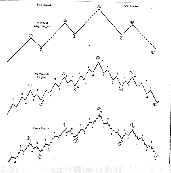
the Dow Theory has been around for decades, the Elliott Wave acquired a
wide following in the 1980s. Elliot's theory was that the market moves in waves
of various sizes, from those encompassing only individual trades to those
lasting centuries, perhaps longer. In the classic Elliot wave, a cycle lasts
200 years and has 8 waves – five up and three down – with smaller cycles within
each of these waves. By classifying these waves and counting the various
classifications, he argued that it was possible to determine the relative
positions of the market at all times.
In the aftermath of the 1987 crash, there were
several newsletters that based upon the Elliott Wave.[7]
Most of them faded in the years after, as the predictive power of the model was
found to be wanting.
Other
cycles include: the Kitchen cycle
(inventories, 3-5 years); the Juglar Cycle (fixed investment patterns, 7-11 years); and Kuznets
Cycle (building patterns, 15-25 years).
Other more controversial theories include: the Kondratyev Cycle (also called "the long economic cycle,"
about 54 years) in three stages of upswing, crisis, and depression. The Babson
chart of business barometers uses
statistics and charts to model a 20-year cycle in four stages: overexpansion,
decline, depression, and improvement.