Market Timing Approaches
There
as probably as many market timing approaches as there are investors. Some of these
approaches are based upon non-financial indicators, some on macroeconomic
variables such as interest rates and business cycles and some draw on the
valuation tools that we used to analyze individual stocks – discounted cashflow
and relative valuation models.
Market Timing based upon Non-financial Indicators
Through
the decades, there are some investors who have claimed to foretell the market’s
future by looking at non-financial indicators. Some of these indicators, such
as whether the NFC or AFC team wins the Super Bowl are clearly of dubious
origin and would fall into a category that we title spurious indicators. Other
indicators such as the hemline index, which relates stock prices to the length
of hemlines on skirts, fall into the grouping of “feel good indicators” that
measure the overall mood of people in the economy, who after all are both the
consumers who act as the engine for the economy and as investors determining
prices. Finally, there are the “hype indicators” that measure whether market prices
are becoming disconnected from reality.
Spurious Indicators
Millions of investors track what
happens to their stocks and to the market every day and it is not surprising
that they find other occurrences that seem to predict what the market will do
next year. Consider one very widely talked-about indicator – who wins the Super
Bowl.[1]
In the 35 years that the Super Bowl has been played from 1966 to 2001, the
winner has come from the National Football Conference (or is an old pre-merger
NFL team like the Steelers or Colts) 25 years, and the market has risen in 22
out of the 25 years. In the 10 years that an American Football Conference team
has won, the market has fallen 7 times. In fact, there are academic researchers
who claim that the success rate of 83% (29 out of 35 years) is far too high to
due to chance. [2]
So why not invest in the market
after observing who wins the Super Bowl? There are several potential problems. First,
we disagree that chance cannot explain this phenomenon. When you have hundreds
of potential indicators that you can use to time markets, there will be some
that show an unusually high correlation purely by chance. Second, a forecast of
market direction (up or down) does not really qualify as market timing, since
how much the market goes up clearly does make a difference. Third, you should
always be cautious when you can find no economic link between the indicator and
the market. There is no conceivable reason who wins the Super Bowl should
affect or be correlated with overall economic performance. Indicators such as
these may make for amusing anecdotes at parties but can be lethal to your
portfolio as market timing devices.
Feel Good Indicators
When
people feel optimistic about the future, it is not just stock prices that are
affected by this optimism. Often, there are social consequences as well, with
styles and social mores affected by the fact that investors and consumers feel
good about the economy. In the 1920s, for instance, you had the Great Gatsby
and the go-go years, as people partied and the markets zoomed up. In the 1980s,
in another big bull market, you had the storied parties and excesses of Wall
Street, documented in books like Liars Poker and movies like Wall Street. It is
not surprising, therefore, that people have discovered linkages between social
indicators and Wall Street. Consider, for instance, an index that has been
around for decades called the hemline index that finds a correlation between
the hemlines on women’s skirts and the stock market. This politically incorrect
index is based on the notion that shorter dresses and shirts are associated
with rising stock prices whereas longer dresses are predictors of stock market
decline. Assuming the index works, we would argue that you are seeing a
manifestation of the same phenomenon. As people get more upbeat, fashions do
seem to get more daring (with higher hemlines following) and markets also seem
to go up. You could undoubtedly construct other indices that have similar
correlations. For instance, you should expect to see a high correlation between
demand at highly priced restaurants at New York City (or wherever young
investment bankers and traders go) and the market.
The
problem with feel good indicators, in general, is that they tend to be
contemporaneous or lagging rather than leading indicators. In other words, the
hemlines don’t drop before the markets drop but in conjunction with or after a
market drop. As an investor, these indicators are off little use, since your
objective is to get out before the market drops and to get in before the market
goes up.
Hype Indicators
It
is said that Joseph Kennedy, a well known speculator on stocks in his own time,
knew it was time to get out of the market when he heard his shoe-shine boy
talking about stocks. In our own time, there are some who believe that the
market peaked when financial channel CNBC’s ratings exceeded those of
long-running soap operas. In fact, one recent indicator called the “cocktail
party chatter” indicator tracks three measures – the time elapsed at a party
before talk turns to stocks, the average age of the people discussing stocks
and the fad component of the chatter. According to the indicator, the less time
it takes for the talk to turn to stocks, the lower the average age of the market
discussants and the greater the fad component, the more negative you should be
about future stock price movements.
Harking back to our discussion of
bubbles, remember that propagation is critical to bubbles getting bigger. In
our media world, this will involve print, television and the internet and an
overflow into day-to-day conversations. Thus, the discussion at the water
cooler in a typical business is more likely to be about stocks than about
football or other such daily (and more normal) obsessions, when markets are buoyant.
While hype indicators, of all
non-financial indicators, offer the most promise as predictors of the market,
they do suffer from several limitations. For instance, defining what
constitutes abnormal can be tricky in a world where standards and tastes are
shifting – a high rating for CNBC may be indicate too much hype or may be just
reflecting of the fact that viewers find financial markets to be both more
entertaining and less predictable than a typical soap opera. Even if we decide
that there is an abnormally high interest in the market today and you conclude
(based upon the hype indicators) that stocks are over valued, there is no
guarantee that stocks will not get more overvalued, before the correction
occurs. In other words, hype indicators may tell you that a market is
overvalued, but they don’t tell you when the correction will occur.
Market Timing based upon Technical Indicators
In
chapter 7, we examined a number of chart patterns and technical indicators used
by analysts to differentiate between under and over valued stocks. Many of
these indicators are also used by analysts to determine whether and by how much
the entire market is under or over valued. In this section, we consider some of
these indicators.
Past Prices
In
chapter 7, we looked at evidence of negative long term correlation in stock
prices – stocks that have gone up the most in recent periods (defined as
semi-annual or annual ) are more likely to go down in future periods. Studies do
not seem to find similar evidence when it comes to the overall market. If
markets have gone up significantly in the most recent years, there is no
evidence that market returns in future years will be negative. If we consolidate
stock returns from 1871 to 2001, into five-year periods, we find a positive
correlation of 20.85% between five-year period returns – in other words,
positive returns over the last five years are more likely to be followed by
positive returns than negative returns in the next 5 years. In table 12.1, we report
on the probabilities of an up-year and a down-year following a series of
scenarios, ranging from 2 down years in a row to 2 up years in a row, based
upon actual stock price data from 1871 to 2001.
Table 12.1:Market
Performance
|
Priors |
Number of
occurrences
|
% of positive
returns |
Average return |
|
After two down years |
19 |
57.90% |
2.95% |
|
After one down year |
30 |
60.00% |
7.76% |
|
After one up year |
30 |
83.33% |
10.92% |
|
After two up years |
51 |
50.98% |
2.79% |
It is true that markets are more
likely to go down after two years of positive performance than under any other
scenario, but there is also evidence of price momentum, with the odds of an up
year increasing if the previous year was an up year. Does this mean that we should
sell all our stocks after two good years? We don’t think so, for two reasons. First, the probabilities of up and down
years do change but note that the likelihood of another good year remains more
than 50% even after 2 consecutive good years in the market. Thus, the cost of
being out of the market is substantial with this market timing strategy.
Second, the fact that the market is overpriced does not mean that all stocks
are over priced. As a stock picker, you may be able to find under valued stocks
even in an over priced market.
Another
price-based indicator that receives attention at least from the media at the beginning
of each calendar year is the January indicator. The indicator posits
that as January goes, so goes the year – if stocks are up, the market will be
up for the year, but a bad beginning usually precedes a poor year.[3]
According to the venerable Stock Trader’s Almanac that is compiled every year
by Yale Hirsch, this indicator has worked 88% of the time. Note, though that if
you exclude January from the year’s returns and compute the returns over the
remaining 11 months of the year, the signal becomes much weaker and returns are
negative only 50% of the time. Thus, selling your stocks after stocks have gone
down in January may not protect you from poor returns.
Trading Volume
There
are some analysts who believe that trading volume can be a much better
indicator of future market returns than past prices. In fact, there are a
number of technical indicators that are used to forecast changes in market
director. Volume indicators are widely used to forecast future market
movements. In fact, price increases that occur without much trading volume are
viewed as less likely to carry over into the next trading period than those
that are accompanied by heavy volume. At the same time, very heavy volume can
also indicate turning points in markets. For instance, a drop in the index with
very heavy trading volume is called a selling climax and may be viewed
as a sign that the market has hit bottom. This supposedly removes most of the
bearish investors from the mix, opening the market up presumably to more
optimistic investors. On the other hand, an increase in the index accompanied
by heavy trading volume may be viewed as a sign that market has topped out. Another
widely used indicator looks at the trading volume on puts as a ratio of the
trading volume on calls. This ratio, which is called the put-call ratio is
often used as a contrarian indicator. When investors become more bearish, they
sell more puts and this (as the contrarian argument goes) is a good sign for
the future of the market.
Technical
analysts also use money flow, which is the difference between uptick
volume and downtick volume, as predictor of market movements. An increase in
the money tick is viewed as a positive signal for future market movements
whereas a decrease is viewed as a bearish signal. Using daily money flows from
July 1997 to June 1998, Bennett and Sias find that money flow is highly
correlated with returns in the same period, which is not surprising. While they
find no predictive ability with short period returns – five day returns are not
correlated with money flow in the previous five days – they do find some
predictive ability for longer periods. With 40-day returns and money flow over
the prior 40 days, for instance, there is a link between high money flow and
positive stock returns.
Chan,
Hameed and Tong extend this analysis to global equity markets. They find that
equity markets show momentum – markets that have done well in the recent past
are more likely to continue doing well,, whereas markets that have done badly
remain poor performers. However, they find that the momentum effect is stronger
for equity markets that have high trading volume and weaker in markets with low
trading volume.
Volatility
In
recent years, a number of studies have uncovered a relationship between changes
in market volatility and future returns. One study by Haugen, Talmor and Torous
in 1991 found that increases in market volatility cause an immediate drop in
stock prices but that stock returns increase in subsequent periods. They looked
at daily price volatility from 1897 through 1988 and look for time periods
where the volatility has increased or decreased significantly, relative to
prior periods. [4] They then
look at returns both at the time of the volatility change and in the weeks
following for both volatility increases and decreases, and their results are
summarized in Figure 12.1:
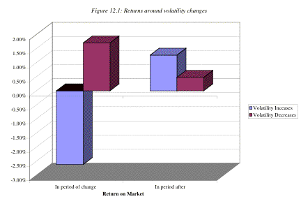
Note that volatility increases cause stock prices to drop
but that stock prices increase in the following four weeks. With volatility
decreases, stock prices increase at the time of the volatility change, and they
continue to increase in the weeks after, albeit at a slower pace.
Does
this mean that you should buy stocks after an increase in volatility? Not necessarily. The increase in returns
in the weeks following a volatility increase may just reflect the reality that
stocks are riskier. However, if you believe that a surge in volatility is
temporary and that stock volatility will revert back to normal levels, a
strategy of buying stocks after an increase in equity market volatility may
bear fruit.
Other Technical Indicators
There
are a number of non-price indicators that are used by analysts to forecast
future market movements. As with stock-specific technical indicators,
market-wide indicators are often used in contradictory ways by momentum and
contrarian analysts, with an increase in a specific indicator being viewed as
bullish by one group and bearish by the other. Since we did cover technical
indicators in depth in chapter 7, we will make only a short mention of some of
these indicators in this section, categorized into price and sentiment
indicators:
- Price
indicators include many of the pricing patterns that we discussed in
chapter 8. Just as support and resistance lines and trend lines are used
to determine when to move in and out of individual stocks, they are also
used to decide when to move in and out of the stock market.
- Sentiment
indicators try to measure the mood of the market. One widely used measure
is the confidence index which is defined to be the ratio of the
yield on BBB rated bonds to the yield on AAA rated bonds. If this ratio
increases, investors are becoming more risk averse or at least demanding a
higher price for taking on risk, which is negative for stocks. Another
indicator that is viewed as bullish for stocks is aggregate insider
buying of stocks. When this measure increases, according to its
proponents, stocks are more likely to go up.[5]
Other sentiment indicators include mutual fund cash positions and the
degree of bullishness among investment advisors/newsletters. These are
often used as contrarian indicators – an increase in cash in the hands of
mutual funds and more bearish market views among mutual funds is viewed as
bullish signs for stock prices.[6]
While many of these indicators are used widely, they are
mostly backed with anecdotal rather than empirical evidence.
Market Timing based upon Normal Ranges (Mean Reversion)
There
are many investors who believe that prices tend to revert back to what can be
called normal levels after extended periods where they might deviate from these
norms. With the equity market, the normal range is defined usually in terms of
PE ratios whereas with the bond market, a normal range of interest rates is
used to justify betting on market direction.
Is there a normal range for PE ratios?
Buy
if the PE drops below 12 and sell if it rises above 18. You will see variations
of this advice in many market testing newsletters. The implicit belief here is
that there is a normal range for PE ratio and that if the PE rises above the
top end of the range, stocks are likely to be overvalued, whereas if they fall
below the bottom of the range, they are likely to be overvalued. While the
approach is straightforward, where does the normal range of PE ratios come
from? In most cases, it seems to come from looking at history and attaching a
subjective judgment on the upper and lower limits.
Consider,
for instance, figure 12.2 which presents PE ratios for the S&P 500 going
back to 1960.
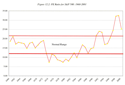
We have attempted to draw a normal range for interest rates
in the United States, based upon history, though it indicates the subjective
judgments that we had to make along the way. Based upon our band, stocks would
be considered as overvalued if they traded at a PE ratio greater than 22 or
less than 12.
The
limitations of this approach should be obvious. In addition to trusting history
to repeat itself, we are making two other assumptions. The first is that we can
identify a normal trading range by looking at historical data. As you can see
from the graph, you will not get any consensus – someone else looking at this
graph might end up with a different band for PE. The second is that the
fundamentals have not shifted significantly over time. If interest rates are
much lower today than they have been historically, you would expect stocks to
trade at much higher PE ratios than they have
historically. How much higher? We will look at this question in more detail in
the later parts of this chapter.
Normal Range of Interest Rates
Some
analysts hypothesize that market interest rates move within a normal range.
Under this hypothesis, when interest rates approach the high end of the range,
they are more likely to decrease, and when they approach the low end of the
range, they are more likely to increase.
This hypothesis is corroborated by two pieces of evidence:
1. Slope of the Yield Curve: The yield curve, which reflects future expectations
about interest rates, is more likely to be downward sloping when interest rates
are high than when there are low. Thus, investors are more likely to expect
interest rates to come down if they are high now and go up, if they are low
now. Table 12.2 below summarizes the frequency of downward sloping yield curves
as a function of the level of interest rates.[7]
Table 12.2: Yield Curves and the Level of Interest Rates
1-year
Corporate Bond Rate Slope
of Yield Curve
Positive Flat Negative
Above
4.40% 0 0 20
1900-70 3.25%
- 4.40% 10 10 5
Below
3.25% 26 0 0
1971-2000 Above 8.00% 4 1 3
Below
8.00% 15 6 1
This evidence is
consistent with the hypothesis that maintains interest rates move within a
normal range; when they approach the upper end (lower end) of the normal range,
the yield curve is more likely to be downward sloping (upward sloping).
2. Interest rate level and
expected change: More significantly,
investors’ expectations about future interest rate movements seem to be borne
out by actual changes in interest rates. When changes in interest rates are regressed
against the current level of interest rates, there is a negative and
significant relationship between the level of the rates and the change in rates
in subsequent periods, i.e., there is a much greater likelihood of a drop in
interest rates next period if interest rates are high in this one, and a much
greater chance of rates increasing in future periods if interest rates are low
in this one. For instance, using treasury bond rates from 1970 to 1995 and
regressing the change in interest rates (D
Interest Ratet) in each year against the level of rates at the end
of the prior year (Interest Ratet-1), we arrive at the following
results:
D Interest Ratet = 0.0139 - 0.1456
Interest Ratet-1 R2=.0728
(1.29) (1.81)
This regression suggests two
things. One is that the change in interest rates in this period is negatively
correlated with the level of rates at the end of the prior year; if rates were
high (low), they were more likely to decrease (increase). Second, for every 1%
increase in the level of current rates, the expected drop in interest rates in
the next period increases by 0.1456%.
This evidence has to be considered with some caveats. The
first is that the proportion of interest rate changes in future periods
explained by the current level of rates is relatively small (about 7.28%);
there are clearly a large number of other factors, most of which are
unpredictable, that affect interest rate changes. The second is that the normal
range of interest rates, which is based upon past experience, might shift if
the underlying inflation changes dramatically as it did in the 1970s in the
United States. Consequently, many firms that delayed borrowing in the early
part of that decade, because they thought that interest rates were at the high
end of the range, found themselves facing higher and higher rates in each of
the following years.
Hindsight is 20/20
Market
timing always seems simple when you look back in time. After the fact, you can
always find obvious signals of market reversals – bull markets turning to bear
markets or vice versa. Thus, in 2001, there were investors who looked back at
1999 and bemoaned the fact that they missed getting out of stocks when the
market topped at the end of that year. At that time, though, the signs were not
so obvious. There were analysts who argued that the market was overvalued and
indicators that supported that point of view, but there were just as many
analysts, if not more, who saw the market continuing to book and had supporting
models.
.In practice, there is
never a consensus among investors on whether markets have hit bottom or peaked
at the time that it occurs. It is an interesting fact that optimism about the
future is greatest just as markets top out and the market mood is darkest just as
markets turn around. To succeed at market timing, you cannot wait until a
bottom has been established before buying or for a market top before selling.
If you do, you will miss much of the subsequent payoff.
Market Timing based upon Fundamentals
Just
as the prices of individual stocks must reflect their cashflows, growth
potential and risk, entire markets (equity, bond and real asset) have to
reflect the fundamentals of these assets. If they do not, you can argue that
they are misvalued. In this section, we consider two ways in which we can bring
fundamentals into market timing models. In the first, we try to develop market timing strategies
based upon the level of fundaemental variables – interest rates and economic
growth, for instance. In the second, we try to extend the valuation techniques
developed for individual stocks to markets.
Fundamental Indicators
You
can try to time markets by developing simple signals based upon macro economic
variables. In this section, we will consider some of these signals – some old
and some new – that have been used by portfolio managers as market timing
tools.
Short term Interest Rates
Buy
stocks when short-term rates (treasury bills) are low and sell them when short
term rates are high, or so goes the conventional wisdom. But is there a basis
to this advice? In table 12.3, we examine stock returns under four treasury
bill scenarios – a decline in rates of more than 1% over the prior year, a drop
of between 0 and 1%, an increase in rates of less than 1% and an increase of
more than 1% between 1928 and 2001.
Table 12.3: Stock Returns and Treasury Bill Rates
|
|
|
In following
year |
|
|
Change in T.Bill rate |
Number of years
|
% of up years |
Average Annual
returns |
|
Drop by more than 1% |
10 |
70% |
10.58% |
|
Drop between 0 and 1% |
24 |
75% |
13.17% |
|
Increase between 0 and 1% |
26 |
69.23% |
11.94% |
|
Incrase more than 1% |
13 |
61.54% |
8.90% |
This result has been confirmed by a
number of academic studies. Ang and Baekart (2001) document that treasury bill
rates dominate other variables as a predictor of short term stock market
movements. Breen, Glosten and Jagannathan (1989) evaluate a strategy of
switching from stock to cash and vice versa, depending upon the treasury bill
rate and conclude that such a strategy would have added about 2% in excess
returns to an actively managed portfolio.
In
a recent study that does raise cautionary notes about this strategy, Abhyankar
and Davies (2002) examine the correlation between treasury bill rates and stock
market returns in sub-periods from 1929 to 2000. They find that almost all of
the predictability of stock market returns comes from the 1950-1975 time period,
and that short term rates have had almost no predictive power since 1975. They
also conclude that short rates have more predictive power with the durable
goods sector and with smaller companies than they do with the entire market.
In
conclusion, then, you should be aware of short term rates when you invest in
the market, but the value of short term rates as a predictor of stock market
movements has decreased over the last few decades. Its remaining predictive
power seems to be restricted to the short term and to sub-sectors of the
market.
Treasury Bond Rate
Intuitively,
it is the treasury bond rate – the long-term riskless rate – that should have a
much stronger impact on stock prices, since it offers a direct alternative to
investing in stocks for the long term. If you can make 8% investing risklessly
in treasuries for the next 30 years, why would you settle for less when investing
in stocks? Thus, we should expect to see stock prices go up if the treasury
bond rate comes down and go down, if the rate goes up. Figure 12.3 presents a
scatter plot of returns on stock returns each year and the T.Bond rate at the
end of the prior year:
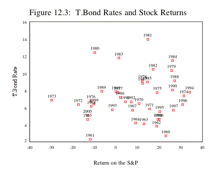
In 1981, for instance, the treasury bond rate at the start of the year was 14%
and the return on the stock index during the year was 15%. In 1961, the
treasury bond rate was 2% and the return on stocks during the year was –11%. If
there is a relationship between treasury bond rates and stock returns during
the period, it is not strong enough to be obvious and there seems to be little
support for the proposition that stock returns are high when interest rates are
low and low when interest rates are high. In fact, stocks did very well in 1980 and 1981, even though
interest rates were very high at the beginning of both those years and very
badly in 1961, notwithstanding the fact that the treasury bond rate was only 2%
at the end of the prior year.
This link between treasury bond
rates and stock returns should become even stronger if we consider how much we
can earn as a return on stocks. You could define this return narrowly as the
dividend yield (dividends/current stock prices) or use a much broader measure,
such as earnings yield, which looks at the overall earnings on the market as a
percent of the current level of the index. The earnings yield is the inverse of
the price earnings ratio and is used widely by market strategists. Rather than
focus on the level of the treasury bond rate, market strategists often look at
the difference between earnings yields and the treasury bond rate. In simpler
terms, they believe that it is best to invest in stocks when earnings yields
are high, relative to the treasury bond rate. In fact, there are some
strategists who believe that stocks are over valued when the earnings yield is
lower than the treasury bond rate. To examine this proposition, we looked at
the difference between the earnings yield and the T.Bond rate at the end of
every year from 1960 to 2000 and the returns on the S&P 500 in the following
year (see table 12.4)
Table 12.4: Earnings Yield, T.Bond Rates and Stock
Returns: 1960 –2001
|
Earnings yield - T.Bond Rate |
Number of years |
Average |
Standard
Deviation |
Maximum |
Minimum |
|
> 2% |
8 |
11.33% |
16.89% |
31.55% |
-11.81% |
|
1 -2% |
5 |
-0.38% |
20.38% |
18.89% |
-29.72% |
|
0-1% |
2 |
19.71% |
0.79% |
20.26% |
19.15% |
|
-1-0% |
6 |
11.21% |
12.93% |
27.25% |
-11.36% |
|
-2-1% |
15 |
9.81% |
17.33% |
34.11% |
-17.37% |
|
< -2% |
5 |
3.04% |
8.40% |
12.40% |
-10.14% |
Business Cycles
As
with treasury bonds, there is an intuitive link between the level of stock
prices and economic growth. You would expect stocks to do much better in
economic booms than during recessions. What makes this relationship tricky,
however, is that market movements are based upon predictions of changes in
economic activity in the future, rather than levels of activity. In other
words, you may see stock prices rising in the depths of a recession, if
investors expect the economy to begin recovering in the next few months.
Alternatively, you may see stock prices drop even in the midst of robust
economic growth, if the growth does not measure up to expectations. In figure
12.4, we have graphed the S&P 500 index and GDP growth going back to 1960:
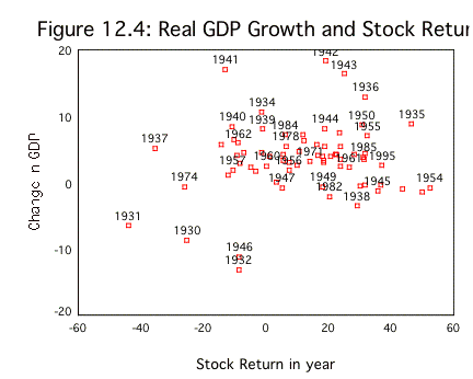
There is a positive relationship between GEP growth during a
year and stock returns during the year, but there is also a lot of noise in the
relationship. Even if the relationship were strong enough to pass muster, you
cannot use it for market timing unless you can forecast real economic growth.
The real question then becomes whether you can make forecasts of future stock market
movements after observing economic growth in the last year. To examine whether
there is any potential payoff to investing after observing economic growth in
the prior year, we looked at the relationship between economic growth in a year
and stock returns in the subsequent year, using data from 1929 to 2001 in table
12.5:
Table 12.5:Real
Economic Growth as a predictor of Stock Returns: 1960 – 2001
|
|
|
Returns in Next
Year |
|||
|
GDP Annual Growth |
Number of years |
Average Return |
Standard deviation in returns |
Best Year |
Worst Year |
|
>5% |
23 |
10.84% |
21.37% |
46.74% |
-35.34% |
|
3.5%-5% |
22 |
14.60% |
16.63% |
52.56% |
-11.85% |
|
2-3.5% |
6 |
12.37% |
13.95% |
26.64% |
-8.81% |
|
0-2% |
5 |
19.43% |
23.29% |
43.72% |
-10.46% |
|
<0% |
16 |
9.94% |
22.68% |
49.98% |
-43.84% |
|
All years |
72 |
12.42% |
19.50% |
52.56% |
-43.84% |
There seems to be no clearly discernible relationship
between returns next year and GDP growth this year. It is true that the years
with negative GDP growth are followed by the lowest stock returns, but the
average stock returns in this scenario are barely higher than the average
returns you would have earned if you had bought after the best economic growth
years (growth exceeds 5%).
If
you can forecast future growth in the economy, it can be useful at two levels.
One is in overall market timing, since you will steer more of your funds into
stocks prior to better-than-expected economic growth and away from stocks when
you foresee the economy slowing. You can also use the information to over invest
in those sectors that are most sensitive to the economic cycle – automobile and
housing stocks, for instance – if you believe that robust economic growth is
around the corner.
Intrinsic Value Models
One
way in which we can take the individual fundamentals that we considered in the
last section and consolidate them into one market view is to do an intrinsic
valuation of the entire market. What, you might ask, is an intrinsic valuation?
Back in chapter 4, we consider how an individual stock can be valued using a
discounted cash flow model as the present value of expected cashflows in the
future. A market is composed of individual assets, and if individual assets can
be valued using discounted cashflow models, we see no reason why the entire
market cannot be valued as the present value of expected cashflows. In this
section, we consider how best to extend discounted cashflow models to valuing the
market, and the value that may be added from doing so.
Extending DCF Models to the Market
Consider,
for instance, the dividend discount model that we introduced in chapter 4. We
argued that the value of a stock can be written as the present value of the expected
dividends from owning the stock, discounted back at the cost of equity. Extending this argument to an index,
the value of an index can also be written as the present value of the expected
dividends on the index. Thus, if the dividends on the entire stock index are
expected to be $ 40 next year, the expected growth rate in perpetuity is
expected to be 4% and the cost of equity for the average risk stock is expected
to be 9%, you could value the index as follows:
Value of index = Expected dividends next year / (Cost of
equity – Expected growth rate)
=
40 / (.09 - .04) = 800
As with an individual stock, this model can be extended to
allow for high growth. Thus, if you expected dividends to grow 10% a year for the
next 5 years and then expect the growth rate to drop to 4% in perpetuity, the
value of the index can be computed in Table 12.6.
Table 12.6: Valuing an Index with High Growth
|
|
Dividends |
Terminal value |
Present Value |
|
1 |
$40.00 |
|
$36.70 |
|
$44.00 |
|
$37.03 |
|
|
3 |
$48.40 |
|
$37.37 |
|
4 |
$53.24 |
|
$37.72 |
|
5 |
$58.56 |
$1,218.13 |
$829.76 |
|
Value of Index = |
$978.59 |
||
Note that the dividends grow at 10% until year 5 and that
the terminal value of the index is based upon a 4% growth rate forever.
Terminal value – 58.56 (1.04)/(.09-.04) = $1,218.13
We
noted one limitation of dividend discount models is that companies may not pay
out what they can afford to in dividends or may choose alternative ways of
returning cash to stockholders (stock buybacks, for instance). You can modify
this model by replacing dividends with potential dividends (free cashflows to
equity for the index) or by augmenting dividends with stock buybacks on the
index.
Some Caveats
While
the building blocks for discounted cashflow valuation may remain the same for
individual stocks and the markets, there are some cautionary notes that need to
be added when valuing entire markets.
- While
we allowed for the possibility of high growth in the last section, you
should be much more cautious about assuming high growth, both in terms of
the growth rate and how long high growth will continue - for a market than
you would be for an individual stock, especially when the market is
broadly based. Consider, for instance, the S&P 500. Since it includes
the 500 companies with the largest market capitalization, arguing that
earnings for these companies will grow at a rate much higher than the
growth rate of the economy implies that the profit margins of these
companies will increase over time. While this is feasible in the short
term, especially if the economy is coming out of a recession or if firms
are restructuring, we do not see how this can be sustained in the long
term.
- The
cost of equity that we are considering here is the cost of equity for the
entire index. If we are considering a broadly based equity index, this
cost of equity should reflect the riskless rate and the risk premium that
investors demand for investing in equities as a class.
On the plus side, you should have
less trouble forecasting earnings and dividends for an index than you should
with individual stocks. After all, you have the luxury of diversification. In
other words, you may over estimate earnings on some stocks and under estimate
earnings on other stocks, but your overall measure of earnings can still be
fairly precise.
Illustration 12.1: Valuing the S&P 500 using a
dividend discount model: January 1, 2001
On
January 1, 2001, the S&P 500 index was trading at 1320. The dividend yield
on the index based upon dividends paid in 2000 was only 1.43%, but including
stock buybacks (from 2000) increases the composite dividend yield (dividends +
stock buybacks) to 2.50%. Analysts were estimating that the earnings of the
stocks in the index would grow 7.5% a year for the next 5 years. Beyond year 5,
the expected growth rate is expected to be 5%, the nominal growth rate in the
economy. The treasury bond rate was 5.1% and we will use a market risk premium
of 4%, leading to a cost of equity of 9.1%:
Cost of equity = 5.1% + 4% = 9.1%
The expected dividends (and stock buybacks) on the index for
the next 5 years can be estimated from the current dividends and expected
growth of 7.50%.
Current dividends = 2.50% of 1320 = 33.00
|
|
1 |
2 |
3 |
4 |
5 |
|
Expected Dividends = |
$35.48 |
$38.14 |
$41.00 |
$44.07 |
$47.38 |
|
Present Value = |
$32.52 |
$32.04 |
$31.57 |
$31.11 |
$30.65 |
The present value is computed by discounting back the
dividends at 9.1%. To estimate the terminal value, we estimate dividends in
year 6 on the index:
Expected dividends in year 6 = $47.38 (1.05) = $49.74
Terminal value of the index = ![]()
Present value of Terminal value = ![]()
The value of the index can now be computed:
Value of index = Present value of dividends during high
growth + Present value of terminal value = $32.52+32.04+31.57+$31.11+ $30.65+
$785 = 943
Based upon this, we would have concluded that the index was
over valued at 1320.
How well do intrinsic valuation models work?
How
well would a strategy of buying the index when it is intrinsically undervalued
and selling when it is intrinsically overvalued do? It is difficult to answer
this question because it depends upon the inputs you estimate for the intrinsic
valuation model and your time horizon. Generally speaking, the odds of
succeeding increase as the quality of your inputs improves and your time
horizon lengthens. Eventually, markets seem to revert back to intrinsic value
but eventually can be a long time coming.
There
is, however, a significant cost associated with using intrinsic valuation
models when they find equity markets to be overvalued. If you take the logical
next step of not investing in stocks when they are overvalued, you will have to
invest your funds in either other securities that you believe are fairly valued
(such as short term government securities) or in other asset classes. In the
process, you may end up out of the stock market for extended periods while the
market is, in fact, going up. For instance, most intrinsic value models would
have suggested that the equity market in the United States was overvalued
starting in 1994. If you had followed through and not invested in equities
until 2002 (when the models suggested that valuations were fair again), you
would have lost far more (by not investing in the bull market between 1994 and
2000) than you would have gained (by not investing in the down markets of 2001
and 2002).
The
problem with intrinsic value models is their failure to capture permanent
shifts in attitudes towards risk or investor characteristics. This is because
so many of the inputs for these models comes from looking at the past. Thus,
the risk premium used to come up with the cost of equity may have been
estimated looking at historical data on stock and bond returns and dividends
may reflect what companies did last year. If one or both have changed as a
consequence of shifts in the market, you will get a misleading signal from
intrinsic valuation models. In fact, many investors who used intrinsic value
models bought stocks during the early 1970s as stock prices dropped and failed
to take into account the seismic shifts created by the high inflation of that
period.
Relative Value Models
In
relative value models, you examine how markets are priced relative to other
markets and to fundamentals. How is this different from intrinsic value models?
While the two approaches shares some characteristics, it is less rigid, insofar
as it does not require that you work within the structure of a discounted
cashflow model. Instead, you
either make comparisons of markets over time (the S&P in 2002 versus the
S&P in 1990) or different markets at the same point in time (U.S. stocks in
2002 versus European stocks in 2002).
Comparisons Across Time
In its simplest form, you can
compare the way stocks are priced today to the way they used to be priced in
the past and draw conclusions on that basis. Thus, as we noted in the section
on historic norms, many analysts argue that stocks today, priced at 25 times
earnings, are too expensive because stocks historically have been priced at
15-16 times earnings.
While reversion to historic norms
remains a very strong force in financial markets, we should be cautious about
drawing too strong a conclusion from such comparisons. As the fundamentals
(interest rates, risk premiums, expected growth and payout) change over time,
the PE ratio will also change. Other things remaining equal, for instance, we
would expect the following.
- An
increase in interest rates should result in a higher cost of equity for
the market and a lower PE ratio.
- A
greater willingness to take risk on the part of investors will result in a
lower risk premium for equity and a higher PE ratio across all stocks.
- An
increase in expected growth in earnings across firms will result in a
higher PE ratio for the market.
In other words, it is difficult to draw conclusions about PE
ratios without looking at these fundamentals. A more appropriate comparison is
therefore not between PE ratios across time, but between the actual PE ratio
and the predicted PE ratio based upon fundamentals existing at that time.
Illustration 12.2: PE Ratios across time for the S&P
500
Figure
12.5 summarizes the Earnings/Price ratios for S&P 500, treasury bond rates and
the difference between bond and bill rates at the end of each year from 1960 to
2000.
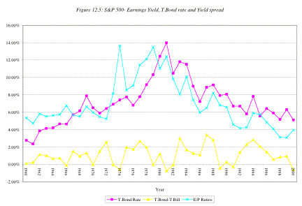
You do not need to be a
statistician to note that earnings to price ratios are high (and PE ratios are
low) when the treasury bond rates are high, and the earnings to price ratios
decline when treasury bond rates drop.
This strong positive relationship between E/P ratios and T.Bond rates is
evidenced by the correlation of 0.6854 between the two variables. In addition,
there is evidence that the term structure also affects the E/P ratio. In the
following regression, we regress E/P ratios against the level of T.Bond rates
and the yield spread (T.Bond - T.Bill rate), using data from 1960 to 2000.
E/P = 0.0188 + 0.7762 T.Bond Rate
- 0.4066 (T.Bond Rate-T.Bill Rate) R2
= 0.495
(1.93) (6.08) (-1.37)
Other things remaining equal, this
regression suggests that
·
Every 1% increase in the T.Bond rate increases the E/P
ratio by 0.7762%. This is not surprising but it quantifies the impact that
higher interest rates have on the PE ratio.
·
Every 1% increase in the difference between T.Bond and
T.Bill rates reduces the E/P ratio by 0.4066%. Flatter or negative sloping term yield curves seem to
correspond to lower PE ratios and upwards sloping yield curves to higher PE
ratios. While, at first sight, this
may seem surprising, the slope of the yield curve, at least in the United
States, has been a leading indicator of economic growth with more upward sloped
curves going with higher growth.
Based upon this regression, we predict E/P ratio at the
beginning of 2001, with the T.Bill rate at 4.9% and the T.Bond rate at 5.1%.
E/P2000 = 0.0188 + 0.7762 (0.051) – 0.4066 (0.051-0.049) = 0.0599 or 5.99%
PE2000
![]()
Since the S&P 500 was trading at a multiple of 25 times
earnings in early 2001, this would have indicated an over valued market. This regression can be enriched by adding
other variables, which should be correlated to the price-earnings ratio, such
as expected growth in GNP and payout ratios, as independent variables. In fact,
a fairly strong argument can be made that the influx of technology stocks into
the S&P 500 over the last decade, the increase in return on equity at U.S.
companies over the same period and a decline in risk premiums could all explain
the increase in PE ratios over the period.