 The
Little Book of Valuation
The
Little Book of Valuation
Looking for Relationships in the Data
When
there are two series of data, there are a number of statistical measures that
can be used to capture how the series move together over time.
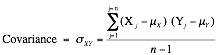
Correlations and Covariances
The two most
widely used measures of how two variables move together (or do not) are the
correlation and the covariance. For two data series, X (X1, X2,)
and Y(Y, Y. . .), the covariance provides a measure of
the degree to which they move together and is estimated by taking the product
of the deviations from the mean for each variable in each period.
The sign on the covariance indicates the type of relationship the two
variables have. A positive sign indicates that they move together and a
negative sign that they move in opposite directions. Although the covariance
increases with the strength of the relationship, it is still relatively
difficult to draw judgments on the strength of the relationship between two
variables by looking at the covariance, because it is not standardized.
The
correlation is the standardized measure of the relationship between two
variables. It can be computed from the covariance :
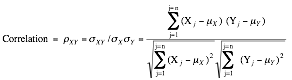
The correlation can never be
greater than one or less than negative one. A correlation close to zero
indicates that the two variables are unrelated. A positive correlation
indicates that the two variables move together, and the relationship is
stronger as the correlation gets closer to one. A negative correlation
indicates the two variables move in opposite directions, and that relationship
gets stronger the as the correlation gets closer to negative one. Two variables
that are perfectly positively correlated (rXY = 1) essentially move in
perfect proportion in the same direction, whereas two variables that are
perfectly negatively correlated move in perfect proportion in opposite
directions.
Regressions
A
simple regression is an extension of
the correlation/covariance concept. It attempts to explain one variable, the
dependent variable, using the other variable, the independent variable.
Scatter Plots and Regression Lines
Keeping with statistical tradition, let Y be the dependent variable and X be the independent variable. If the
two variables are plotted against each other with each pair of observations
representing a point on the graph, you have a scatterplot, with Y on the vertical axis and X on the horizontal axis. Figure A1.3 illustrates a scatter plot.
Figure
A1.3: Scatter Plot of Y versus X

In a regression,
we attempt to fit a straight line through the points that best fits the data.
In its simplest form, this is accomplished by finding a line that minimizes the
sum of the squared deviations of the points from the line. Consequently, it is
called an ordinary least squares
(OLS) regression. When such a line is fit, two parameters emerge—one is
the point at which the line cuts through the Y-axis, called the intercept of the regression, and the other is
the slope of the regression line:
Y = a
+ bX
The slope (b) of the regression measures both the direction and the magnitude
of the relationship between the dependent variable (Y) and the independent variable (X). When the two variables are positively correlated, the slope
will also be positive, whereas when the two variables are negatively correlated,
the slope will be negative. The magnitude of the slope of the regression can be
read as follows: For every unit increase in the dependent variable (X), the independent variable will change
by b (slope).
Estimating Regression Parameters
Although there are
statistical packages that allow us to input data and get the regression
parameters as output, it is worth looking at how they are estimated in the
first place. The slope of the regression line is a logical extension of the
covariance concept introduced in the last section. In fact, the slope is
estimated using the covariance:
![]()
The intercept (a) of the regression can be read in a number of ways. One
interpretation is that it is the value that Y
will have when X is zero. Another is
more straightforward and is based on how it is calculated. It is the difference
between the average value of Y, and
the slope-adjusted value of X.
![]()
Regression parameters are always
estimated with some error or statistical noise, partly because the relationship
between the variables is not perfect and partly because we estimate them from
samples of data. This noise is captured in a couple of statistics. One is the R2 of the regression, which
measures the proportion of the variability in the dependent variable (Y) that is explained by the independent
variable (X). It is also a direct
function of the correlation between the variables:
![]()
An R2 value close to one indicates a strong relationship
between the two variables, though the relationship may be either positive or
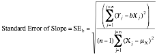
negative. Another measure of noise in a regression is the standard error, which
measures the “spread” around each of the two parameters estimated—the
intercept and the slope. Each parameter has an associated standard error, which
is calculated from the data:
Standard Error of Intercept = SEa =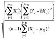
If we make the additional
assumption that the intercept and slope estimates are normally distributed, the
parameter estimate and the standard error can be combined to get a t-statistic that measures whether the
relationship is statistically significant.
t-Statistic
for Intercept = a/SEa
t-Statistic
from Slope = b/SEb
For samples with more than 120
observations, a t-statistic greater
than 1.95 indicates that the variable is significantly different from zero with
95% certainty, whereas a statistic greater than 2.33 indicates the same with
99% certainty. For smaller samples, the t-statistic
has to be larger to have statistical significance.[1]
Using Regressions
Although
regressions mirror correlation coefficients and covariances in showing the
strength of the relationship between two variables, they also serve another
useful purpose. The regression equation described in the last section can be
used to estimate predicted values for the dependent variable, based on assumed
or actual values for the independent variable. In other words, for any given Y, we can estimate what X should be:
X = a
+ b(Y)
How good are these predictions? That
will depend entirely on the strength of the relationship measured in the
regression. When the independent variable explains a high proportion of the
variation in the dependent variable (R2 is high), the predictions
will be precise. When the R2 is low, the predictions will have a
much wider range.
From Simple to Multiple Regressions
The
regression that measures the relationship between two variables becomes a
multiple regression when it is extended to include more than
one independent variables (X1, X2, X3,
X4 . . .) in trying to explain the
dependent variable Y. Although
the graphical presentation becomes more difficult, the multiple regression yields output that is an extension of the simple
regression.
Y = a
+ bX1 + cX2 + dX3 + eX4
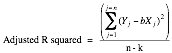
The R2 still measures the strength of the relationship, but
an additional R2 statistic
called the adjusted R2 is
computed to counter the bias that will induce the R2 to keep increasing as more independent variables are
added to the regression. If there are k independent variables in the
regression, the adjusted R2
is computed as follows:

Multiple regressions are powerful
tools that allow us to examine the determinants of any variable.
Regression Assumptions and Constraints
Both the simple
and multiple regressions described in this section also assume linear
relationships between the dependent and independent variables. If the
relationship is not linear, we have two choices. One is to transform the
variables by taking the square, square root, or natural log (for example) of
the values and hope that the relationship between the transformed variables is
more linear. The other is to run nonlinear regressions that attempt to fit a
curve (rather than a straight line) through the data.
There are implicit
statistical assumptions behind every multiple regression that we ignore at our
own peril. For the coefficients on the individual independent variables to make
sense, the independent variable needs to be uncorrelated with each other, a condition
that is often difficult to meet. When independent variables are correlated with
each other, the statistical hazard that is created is called multicollinearity. In its presence, the
coefficients on independent variables can take on unexpected signs (positive
instead of negative, for instance) and unpredictable values. There are simple
diagnostic statistics that allow us to measure how far the data may be
deviating from our ideal.